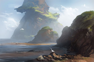
So, painting from photos... this can be a contentious issue. For one, yes it's always going to better to draw/paint/whatever from life. But much of the time it's not practical. The sun is in your eyes, or there's bugs getting in the paint, or it's too windy out, etc. The list is as long as you want it to be whether they're legitimate excuses or not.
But I'm not here to criticize - even as a landscape guy, I do shamefully little plein air paintings, or even sketches. I justify it to myself by taking millions of pictures on my Canon. I could drive to twelve different places and take 20 photos of each location in the same time it takes me to spend an hour in ONE place, studying ONE scene. That's a good trade off in my book.
Anyway, getting to the point... When you ARE painting from those hundreds of millions of photos (*TANGENT* - Just like it's better to paint from life than photos, it is MUCH better to paint from your OWN photos than Google's or anyone else's) I see two options:
1 - You like the photo so much that you're going to copy it directly. This is okay, but be careful... Art-making is about making decisions - whether that be color palette, composition, lighting, or form; by copying a photo directly a lot of those choices are removed from the equation because they've already been solved. In my opinion you're left with little besides technique and how to mix a certain color. Which is fine if that's what you feel you need to work on, but be aware of the drawbacks.
2 - There's an element or elements you like from a photo (or photos) that you want to extrapolate from. Meaning, "I like the way the shadow comes off that mountain" or "I'm going to stick to this color palette. Here's an example:

< main photo reference
finished study >
If it isn't clear, what I really like about the picture was the big hill on the left. The way the light hit it, the composition of it's big shadow, and the beautiful greens of the grass. Obviously I changed a lot, but stack the images and it's quickly apparent how close parts of the two images are:
The composition is largely the same, the color palette is almost a direct copy, and yet some relatively simple changes and additions make for a much more dramatic landscape, without copying the photo directly.
To me is makes for a much better learning experience overall, and a better, more ownable finished product.
Let me know what you guys think and if you'd like some more examples of this.


Wow, your study looks absolutely amazing. I too find that copying photos limits my creativity. I was just talking with someone about this last night actually. He was asking me what I would charge to paint a photograph he showed me on his phone. My reply was "Why? Isn't that photograph lovely enough?" I did the whole copycat thing in high school as a portrait artist but to be an "illustrator" is much more fulfilling. Creating something that no photo can provide reference for allows us to render things that could otherwise never be. Sci-fi and fantasy are my genre of choice so obviously this is of utmost importance, lol!
ReplyDeletewow i really like how you change the landscapes, you knowledge of how perspective, shadow, light, and color really shows.
ReplyDelete